·
1 minute read
·
1 minute read
At Prescient Security, our mission has always been clear: simplify security and compliance. With 5,000+ customers worldwide and deep expertise in cloud-native tech, we're now a trusted name in cybersecurity. We help businesses get certified across 25+ frameworks (SOC, ISO, HITRUST, FedRAMP, GDPR, and more), run penetration tests, and assess security risks. Need to close security gaps fast and affordably? You can be assured, we’ve got your back.
Now, we’re excited to introduce a fresh new chapter for Prescient Security. A rebrand that reflects our broader mission as a global expert in cybersecurity and GRC.
This rebrand has been designed to show our expertise in tech enabled security and compliance, our commitment to top-tier security standards, and our focus on helping clients scale with confidence.
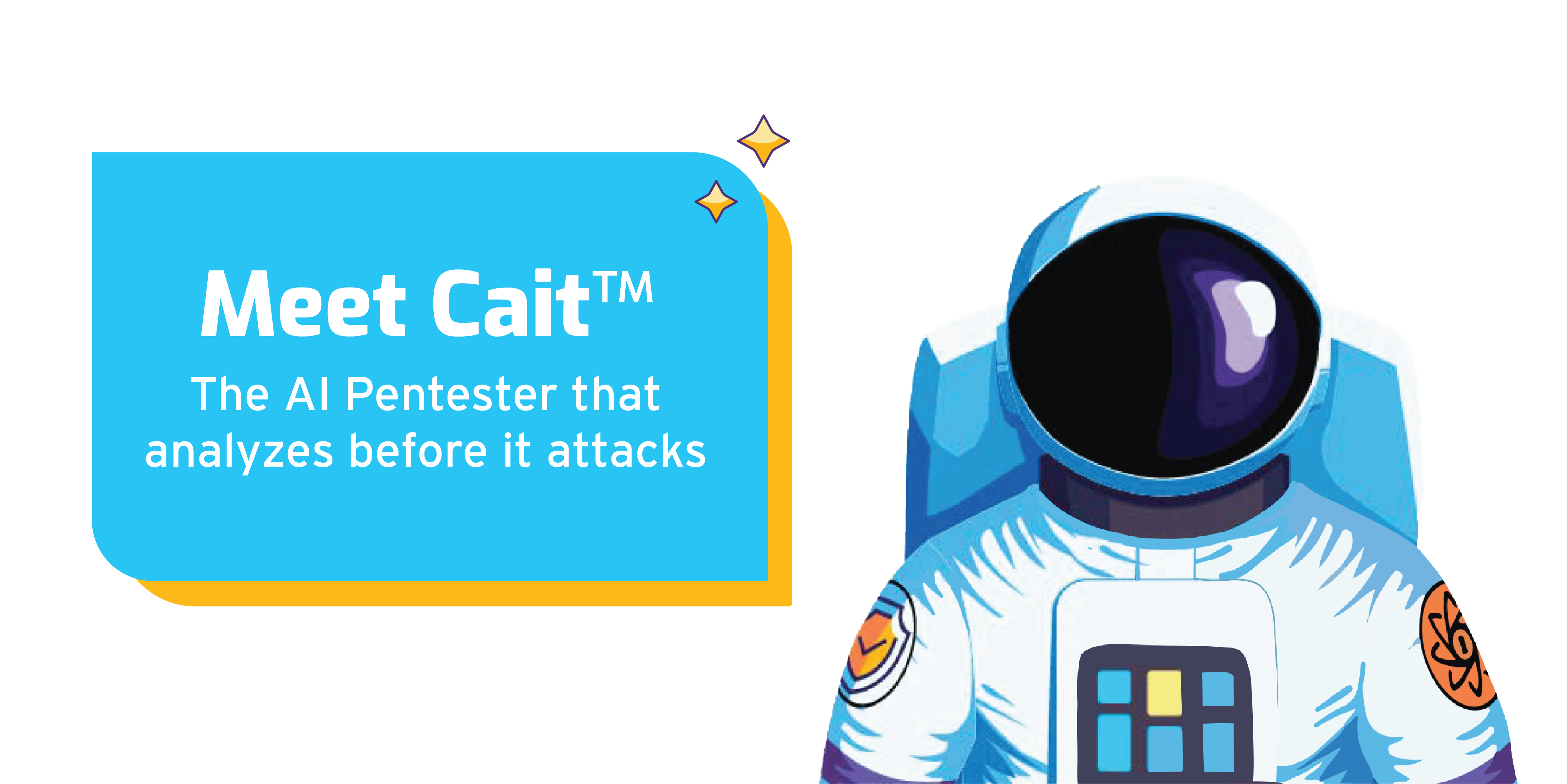
Meet Luma: Prescient Security's New Mascot!

Our new mascot, Luma, symbolizes clarity, expertise, and the light we bring to simplifying compliance. Named after the Portuguese word for "light," Luma reflects our brand’s colors and mission. Anyone that goes into uncharted territory is setting the stage for others to follow - like 'Luma' the astronaut embodying Prescient Security being a guiding light for others in our industry.
Luma, the astronaut, represents the precise and calculated approach, courage and expertise required to explore the unexplored cybersecurity territories. Just like how astronauts manage countless controls and critical systems for a successful mission, we help businesses seamlessly handle their compliances.
A Fresh Approach on Our Visual Identity
New Wordmark and Typography
Our typography plays an important part in building our new brand identity. We wanted a typeface that gives a welcoming, modern, and un-intimidating feeling, just like our approach to cybersecurity. That’s why we chose:
- Interstate: A clean and efficient typeface inspired by Highway Gothic, the official font of American highway signage. It’s structured yet approachable, making it a fan-favourite in the design community.
- Exo 2: A contemporary geometric sans-serif typeface that conveys a technological and futuristic feel while maintaining an elegant, accessible design which perfectly aligns with our services and audience.
Visual Language
Our previous branding leaned toward dark, intimidating visuals. With this rebrand, we wanted to shift the perception of cybersecurity, making it approachable, clear, and reassuring.
We believe security shouldn’t feel overwhelming. Instead, it should feel attainable, easy to understand, and, yes, even friendly.
Thank you for being part of this journey!

Take a look around, explore our new look, and hear directly from our customers about the impact we’re making. If you have feedback, write to us here.
A huge thank you to everyone who made this milestone possible. Stay tuned for more to come from Prescient Security.